Dashboards are a useful tool in my daily work routine. They let me quickly asses how a service is doing without having to re-write the queries for metrics from scratch.
When creating a new dashboard for a service, I was usually at a loss. What graphs do I add? Are these graphs actually helpful? I rarely could answer these questions.
In this post I try to structure my thoughts on what dashboards I want to create and how to create them.
When to look at a dashboard
During an uneventful day at work, I rarely look at any dashboards. There are other things to do like writing code, talking to peers, reviewing code. Yet there are times where I do log into Grafana and check some graphs. I have found that this almost always happens under the following circumstances:
- A new service has been launched and I want to know if its KPIs like Latency, Errors or Traffic are within the expected thresholds
- An incident is ongoing or was recently resolved and I search through graphs of the various metrics exported by a service trying to understand the issue or looking for possible causes
Two types of dashboards
The two points above actually translate nicely into two types of dashboards. I call the first one the “Overview” and the other one the “Drill-down”.
Overview dashboard
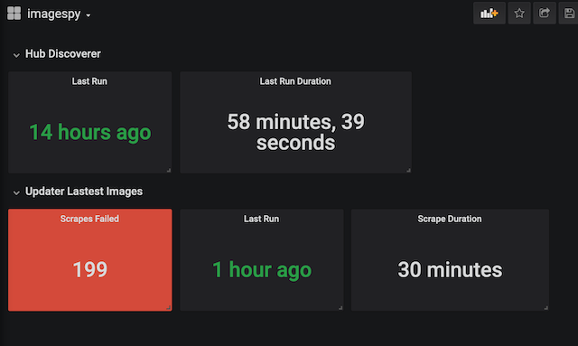
Graphs on an Overview dashboard display the KPIs that are needed in order to tell if a service is performing within its expected boundaries.
I usually follow these steps to determine the KPIs, the boundaries and the graphs:
- Choose one or more of the Four Golden Signals1 that best represent if a service is performing as expected
- For each of the signals chosen, pick a metric and create an alert based on that metric
- Add a graph to the Overview dashboard that displays each metric that backs an alert
It is important to only create a graph for a metric that backs an alert. Doing so keeps the number of graphs low. The lower the number of graphs, the easier it is for me to understand a dashboard.
Adding visual cues, like the option in Grafana to change the background color of a Gauge graph based on the current value of the metric, can be helpful. People not familiar with the service, or people like me who tend to forget things after a while, can gain a better understanding of what is going on. Creating visual cues adds the burden to keep the configuration of a graph and the alert condition in sync though.
Here is a screenshot of an Overview dashboard:

Drill-down dashboard
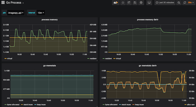
While Overview dashboards are built for a single service, Drill-down dashboards are built for a sub-system within a service or platform. A Drill-down dashboard can be used for many services that make use of the same sub-system. E.g. the Go Process Drill-down dashboard displays graphs of metrics for all service written in Go or the Postgres Drill-down dashboard displays graphs of metrics for all Postgres databases.
The graphs on a Drill-down dashboard display as many metrics as possible as detailed as possible. This is useful when analyzing an incident because it allows me to spot outliers in the graphs.
A collection of Drill-down dashboards that I use:
- Node Drill-down Displays metrics exposed by the Prometheus Node Exporter
- Go Process Drill-down Displays runtime metrics of a Go process exported by the Prometheus Go Client
- Traefik HTTP Drill-down Displays HTTP Status Codes and Latency as exported by Traefik
A great source for those dashboards is the list dashboards built by the Grafana community2.
Here is a screenshot of the Go Process Drill-down dashboard:
